
Charts & Dashboards
How to 12-Column Grid for Dashboard Layouts
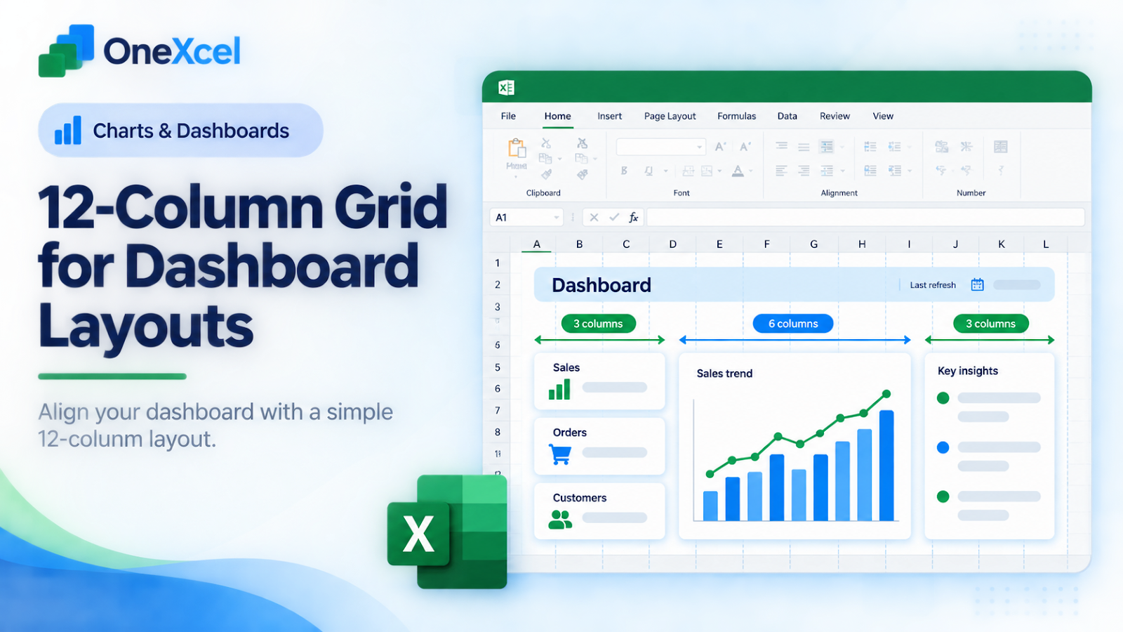
A dashboard becomes easier to scan when cards, charts, and labels align to a repeatable structure. A twelve-column grid gives you enough flexibility for wide charts and narrow KPI cards without forcing every element into the same size.
Start with the right worksheet setup
Start with a blank dashboard sheet and sketch twelve equal columns separated by consistent gutters. You do not need to expose the grid to the reader. Use it as a layout guide: a KPI card might span three columns, a chart six columns, and a commentary panel three columns. Reserve a consistent top band for the dashboard title and refresh date.

Work through the Excel example
Build a simple wireframe before adding chart objects. Place four KPI cards across the first row, each spanning three columns. Put a trend chart across eight columns in the next section and a two-column insight panel beside it. Keep the left edges aligned and use the same internal padding in each card. If you use merged cells for titles, merge only the presentation area; keep the source data and calculations in normal cells on separate sheets.
Keep the original values visible, test a normal case and an exception, then compare the output with the business rule the worksheet is meant to represent.

Verify the result and protect the workflow
Read the dashboard at normal zoom from left to right. The user should see the reporting period, the most important numbers, the main trend, and the next action without hunting. Resize the window and check whether labels remain readable. Print or export a PDF to catch clipped chart titles and awkward page breaks. Test the dashboard with a longer category name and a larger value so the grid is not only correct for ideal sample data.
Common mistakes and corrections
| Mistake | Correction |
|---|---|
| Treating the grid as decoration | The grid should clarify hierarchy and alignment, not add visible clutter. |
| Mixing unrelated card widths | Repeated widths make comparisons faster; reserve unusual spans for genuinely different content. |
| Building charts before the wireframe | Objects become difficult to align and the dashboard grows by accident. |
| Putting calculations inside merged cells | Merged presentation areas are fragile when formulas or filters need to expand. |
Frequently asked questions
Does Excel have a built-in twelve-column dashboard grid?
Not as a named dashboard system; this is a layout method you can implement with columns, spacing, and aligned objects.
Should I merge cells?
Use merging sparingly for presentation labels, not for data tables or calculation ranges.
How many KPIs belong on one page?
Use only the measures needed for the decision. More cards do not automatically improve the dashboard.
Can the grid work with PivotCharts?
Yes. Keep the PivotTable calculations separate and align the resulting charts to the grid.
For related practical lessons, continue through the OneXcel Tutorial Hub and the free Excel resources.
Turn the grid into a repeatable layout rule
Define a small set of card widths before building the dashboard. Three-column KPI cards, six-column charts, and twelve-column full-width sections create rhythm without requiring every object to be the same size. Keep gutters consistent and align the left edge of a chart with the left edge of the cards above it. Alignment is more valuable than decoration because it lets a reader compare sections quickly.
Use the worksheet grid for layout, but keep source tables and calculations outside the presentation surface. A PivotTable can feed a chart while the dashboard displays only the result. If an object needs to move, test the wireframe first rather than resizing a live chart repeatedly. Give each card a clear title, reporting period, and unit so the grid does not hide what the number means.
Finally, test the design with a long label and a missing value. A good grid handles imperfect data without breaking the hierarchy.
Make the result hold up in real work
Treat the twelve-column grid as a contract between the dashboard’s story and its objects. Define a left edge, a right edge, and a gutter before placing shapes. Keep KPI values aligned on the same baseline, and reserve wider spans for charts that need labels or legends. If a chart needs more space, change the grid assignment deliberately instead of nudging every object by eye. Keep source tables, helper calculations, and slicers outside the presentation area. At handoff, note the reporting period and refresh date in the top band. A consistent grid makes later edits safer because a new card has an obvious place to go.
Continue building reliable Excel workflows
Browse more lessons in the OneXcel Tutorial Hub or explore free Excel resources.