
CHARTS & DASHBOARDS
How to Create a Progress Bar Chart in Excel
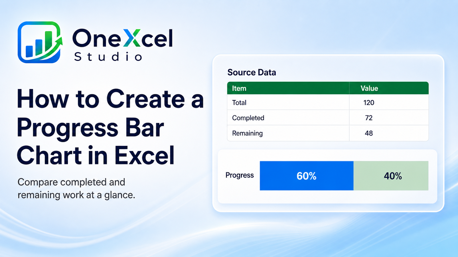
Create a clean Excel progress bar chart that shows completed versus remaining work without adding unnecessary dashboard clutter.
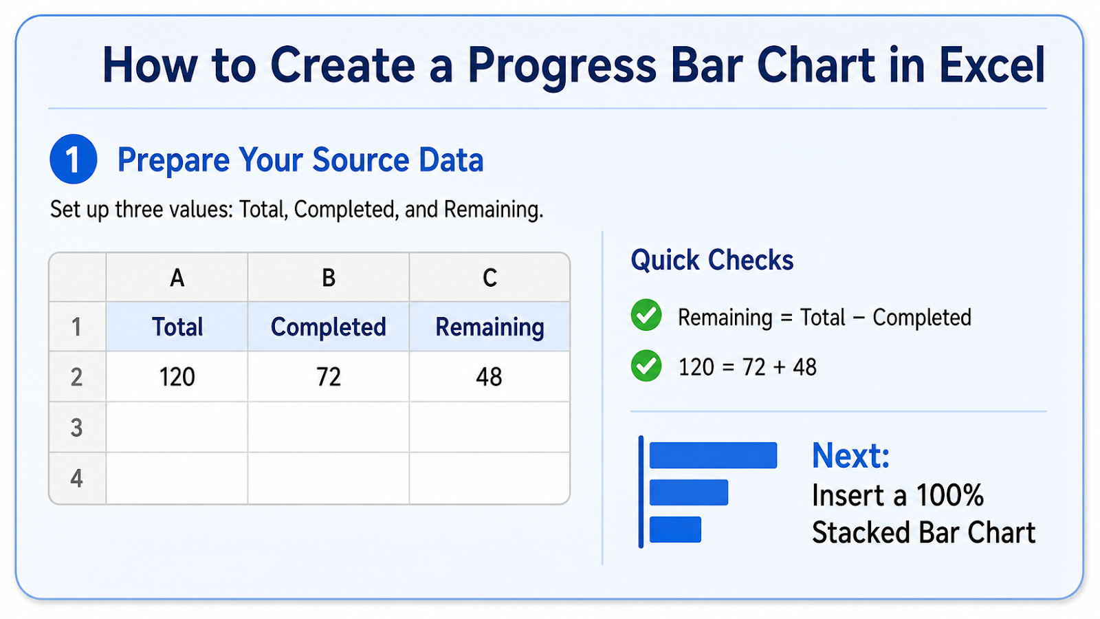
Prepare the source for the progress bar chart showing completed and remaining portions
Use Completed and Remaining values that reconcile to the total, or calculate Remaining as Total minus Completed.
For a fuller tracker structure, continue with the project tracker with status and due dates.
Build the visual
- Calculate percent complete with a safe zero-total check.
- Calculate remaining percentage.
- Insert a 100 percent stacked bar chart.
- Use one category only.
- Format the completed segment strongly and the remaining segment lightly.
- Remove unnecessary axes, borders, and legend.
- Add a clear percentage label.
Design rules
- Keep the bar horizontal and simple.
- Use a neutral background segment.
- Show the percentage as text.
- Do not exceed 100 percent unless the business rule explicitly allows overperformance.
- Use consistent sizing across several progress bars.
Common chart mistakes
| Mistake | Why it matters |
|---|---|
| Using a pie chart for a tiny dashboard status | The comparison is harder to scan. |
| Allowing completed plus remaining to differ from 100 percent | The visual is invalid. |
| Truncating the bar axis | Progress is exaggerated. |
| Using too many colors | The status becomes decorative. |
| Showing percent without defining the denominator | Readers cannot interpret completion. |
Worked progress example
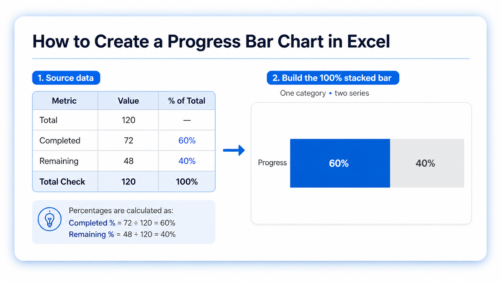
If a project has 72 completed units out of 120 total, percent complete is 60% and remaining is 40%. Those two values should be the only series in a 100% stacked bar. Label the completed portion 60% and keep the remaining segment visually quiet so the chart reads as one status indicator rather than two competing measures.
Define the denominator before using the chart. “60% complete” is meaningless if the total scope changes every week. When scope can change, preserve Total, Completed, and Remaining as separate source values and review whether progress should be recalculated. If completed work can exceed the original plan, decide whether to cap the visual at 100% and show overachievement separately. For a table of many projects, conditional-formatting data bars may be more compact and easier to maintain than dozens of individual charts.
When a report combines several indicators, compare this visual with a KPI dashboard from a PivotTable to give the progress bar a clear reporting context.
Use the percentage label as the primary reading
A progress bar is intentionally simple, so the exact percentage should be visible as text rather than inferred from bar length alone. If completion is 63%, label 63% and let the bar reinforce it. When several projects appear together, use the same 0–100 scale and the same bar width. That makes the visual comparison honest and prevents a short 80% bar from looking weaker than a longer 60% bar created with different chart dimensions.

Frequently asked questions
Can progress exceed 100 percent?
Only when overachievement is meaningful; cap the bar or label the excess separately.
How do I show several projects?
Use one row per project with a consistent 100 percent stacked bar or conditional-formatting data bars.
Can I build it without a chart?
Yes. Conditional-formatting data bars are often simpler.
Why does the label show a decimal?
Apply a percentage number format with the intended precision.
Continue building reliable Excel workflows
Browse more lessons in the OneXcel Tutorial Hub or explore free Excel resources.