
CHARTS & DASHBOARDS
How to Add Sparklines to a Monthly Report
Add Excel sparklines to a monthly report to show compact trends beside each metric while keeping the table easy to scan.
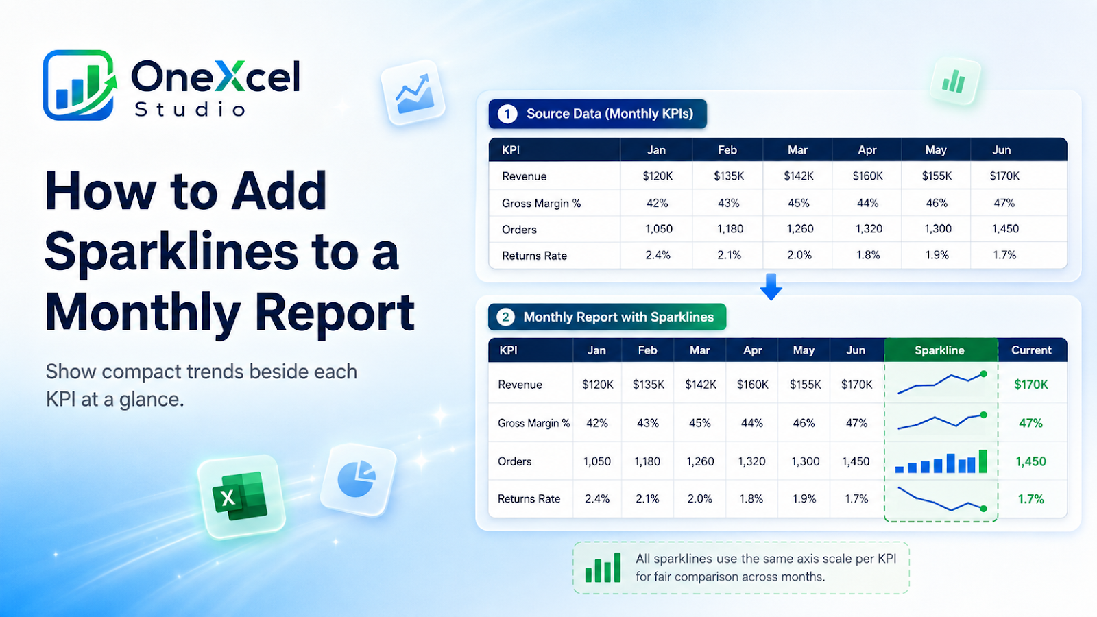
Prepare the source for the sparklines inside a monthly report
Place one row per KPI and a consistent sequence of monthly values across columns.
Build the visual
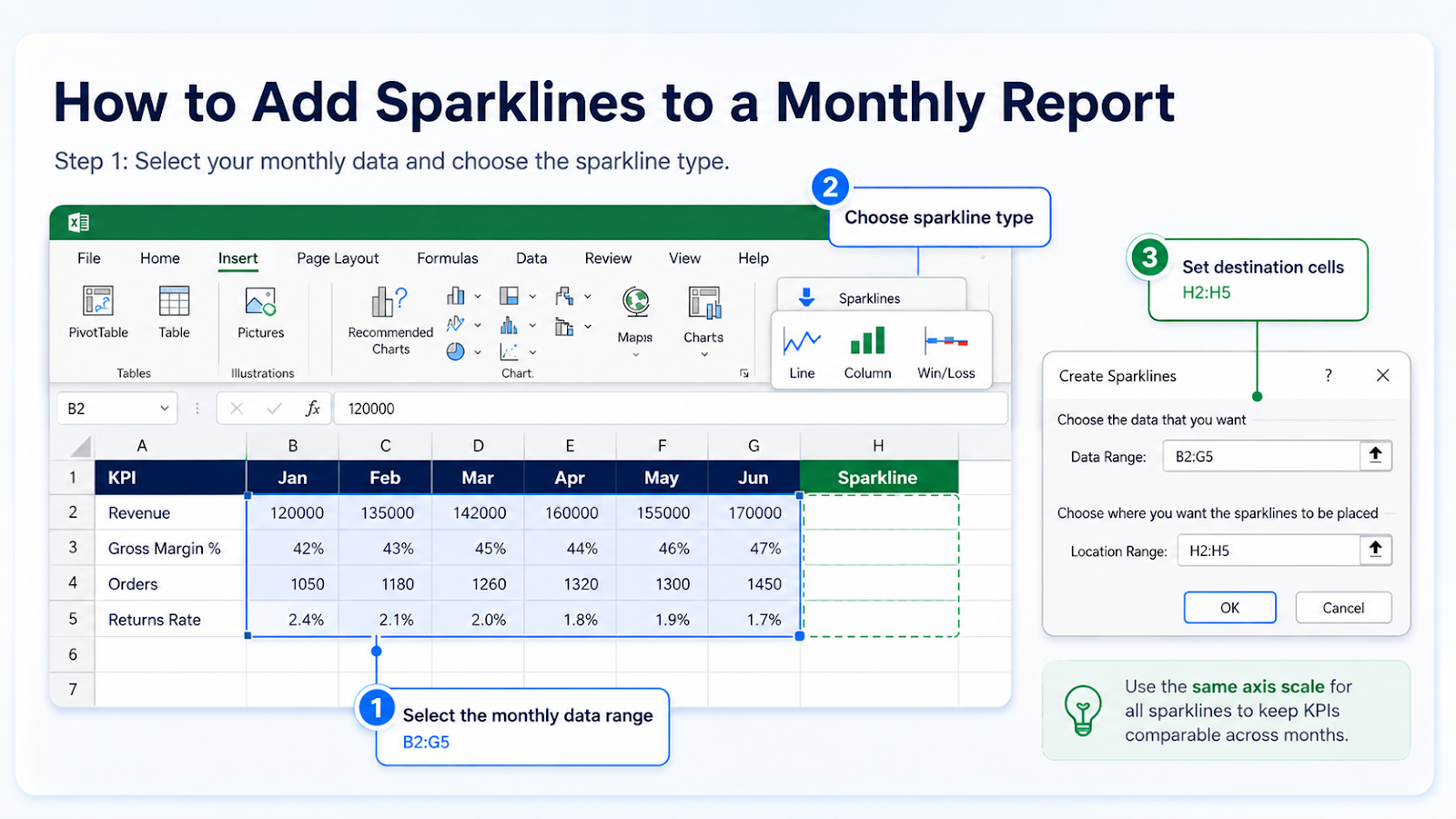
- Select the monthly data range for the first set of rows.
- Insert Line, Column, or Win/Loss Sparklines.
- Choose the destination cells beside the metrics.
- Copy or create the sparkline group for all rows.
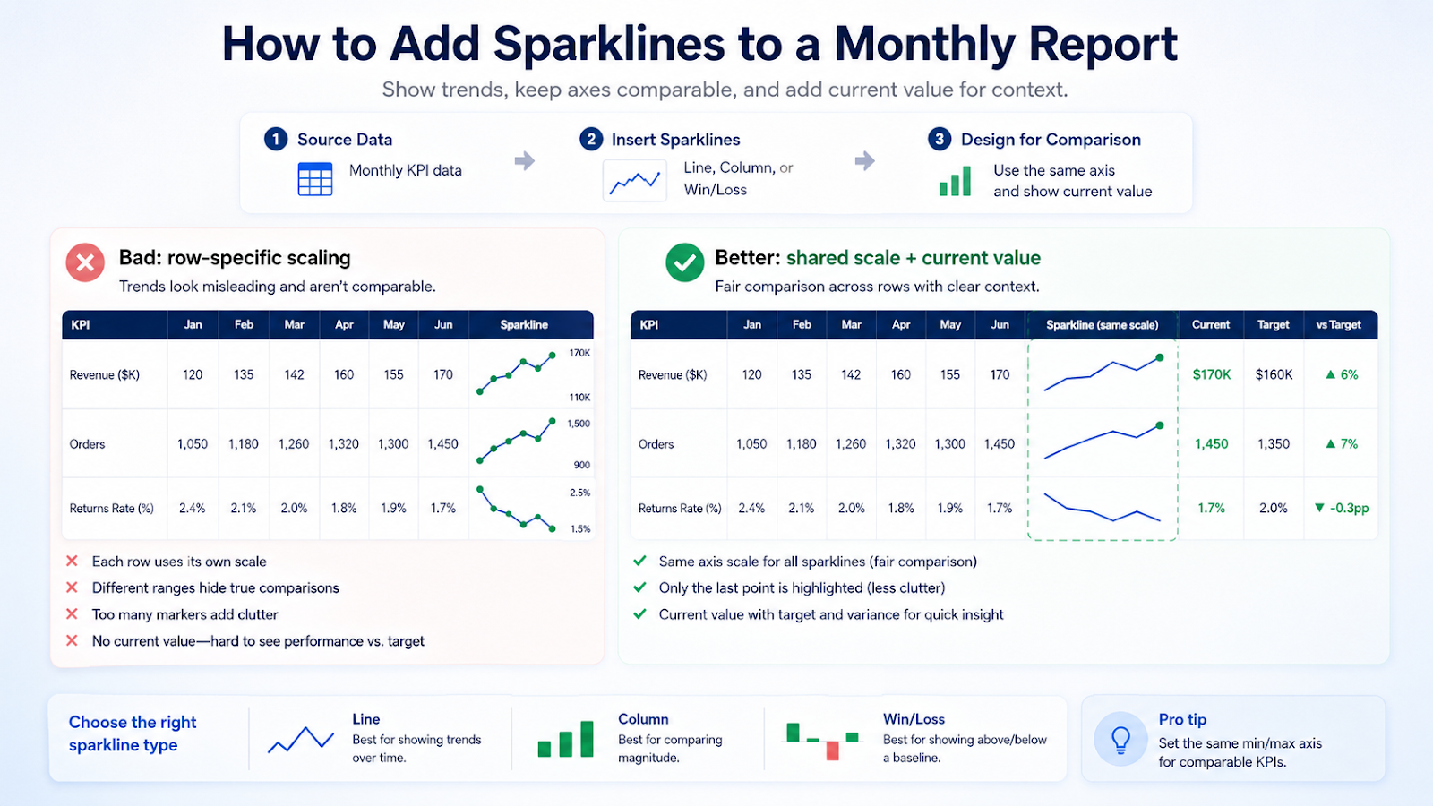
- Use the same vertical axis across comparable metrics.
- Mark high, low, first, or last points only when useful.
- Add a separate current value because sparklines are not precise labels.
Design rules
- Keep the sparkline column wide enough to see the trend.
- Use a consistent axis for fair comparison.
- Avoid too many markers.
- Pair the trend with current value and target context.
- Use Win/Loss only for direction, not magnitude.
Common chart mistakes
| Mistake | Why it matters |
|---|---|
| Allowing every row to use its own scale | Small movements can look as large as major changes. |
| Using different month counts | Trend lengths are not comparable. |
| Treating a sparkline as a full chart | It lacks detailed axes and labels. |
| Including totals or blanks inconsistently | The trend can be distorted. |
| Using color alone to indicate status | Add text or values. |
Make several sparklines comparable
If three departments all report monthly sales, group their sparklines and use the same vertical-axis minimum and maximum. Otherwise a department moving from 100 to 110 can look just as dramatic as another moving from 100 to 200 because each row scales independently. Shared scaling makes the shapes comparable.
Do not force shared scales across unrelated units such as revenue, percentage margin, and headcount. In that case, the sparkline is useful only as an within-row trend cue. Pair each sparkline with the current value, target, or variance so the reader can tell whether the trend is materially good or bad. If a month is missing, decide whether the line should show a gap, zero, or connect across the blank and apply that setting consistently.
Use a shared scale only for comparable KPIs
Sparklines for the same metric across departments should normally share a vertical axis so the shapes are comparable. Sparklines for Revenue, Margin %, and Headcount should not share one scale because their units differ. In that case, use each sparkline only as a within-row direction cue and rely on the adjacent current value and variance for magnitude. The axis choice should follow the comparison the reader is expected to make.

Frequently asked questions
Which sparkline type should I use?
Line shows trend, Column emphasizes magnitude, and Win/Loss shows positive or negative direction.
Can several sparklines share an axis?
Yes. Group them and set the same-axis options.
Do sparklines update with Table data?
They update when their source ranges expand correctly; test new periods.
Can I show missing data as gaps?
Use the hidden-and-empty-cell settings to choose how blanks are displayed.
Continue building reliable Excel workflows
Browse more lessons in the OneXcel Tutorial Hub or explore free Excel resources.