
CHARTS & DASHBOARDS
How to Build a Pareto Chart in Excel
Build a Pareto chart in Excel to rank causes, calculate cumulative impact, and focus attention on the issues that matter most.
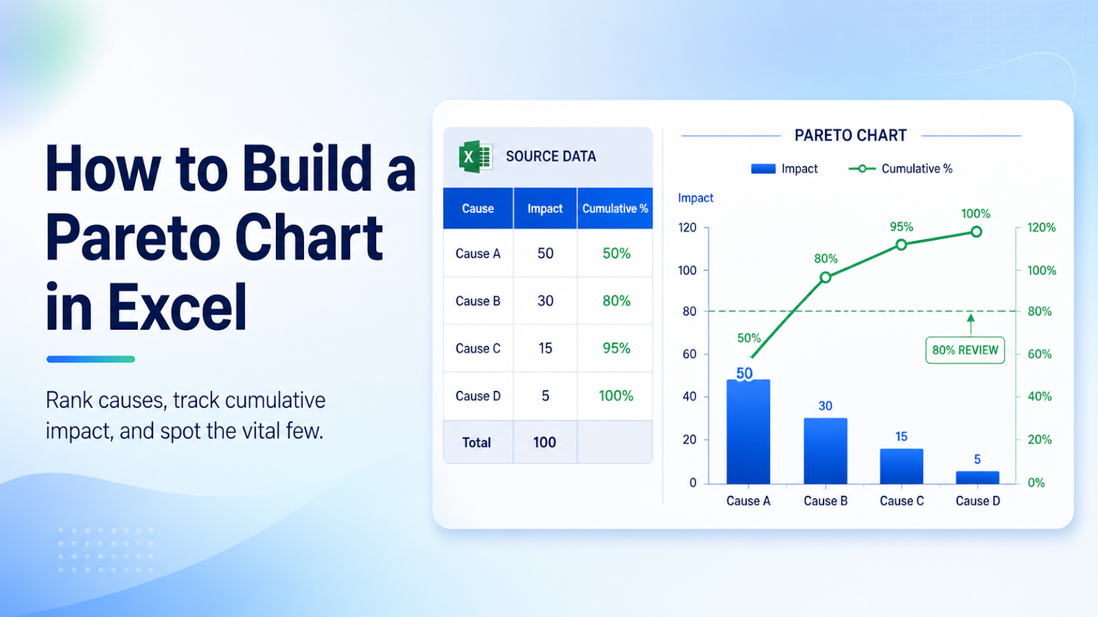
Prepare the source for the Pareto chart with ranked columns and cumulative percentage
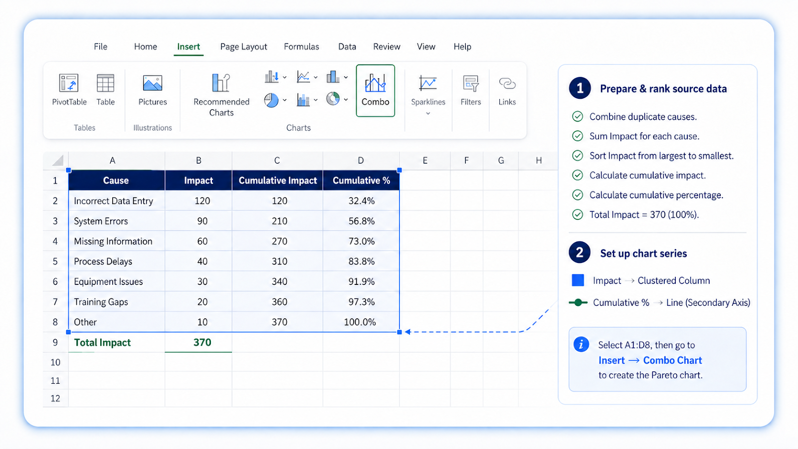
Create a category and impact table, combine duplicate categories, and sort impact from largest to smallest.
Build the visual
- Summarize impact by cause.
- Sort the causes descending.
- Calculate total impact.
- Calculate cumulative impact and cumulative percentage.
- Insert a Pareto chart or build a combo chart with columns and a cumulative line.
- Set the cumulative axis to 0–100 percent.
- Identify the few causes that drive most of the impact.
Design rules
- Keep category labels readable.
- Use one column color and a contrasting cumulative line.
- Show the 80 percent reference only when it supports the analysis.
- Limit the number of displayed categories.
- State the unit of impact.
Common chart mistakes
| Mistake | Why it matters |
|---|---|
| Using unsorted source data | The cumulative line loses its meaning. |
| Counting incidents when cost or time is the real impact | Choose the measure that supports the decision. |
| Treating 80 percent as a law | It is a prioritization guide, not a guaranteed threshold. |
| Leaving duplicate cause names | Impact is split across categories. |
| Using too many tiny categories | The chart becomes cluttered. |
Worked Pareto example
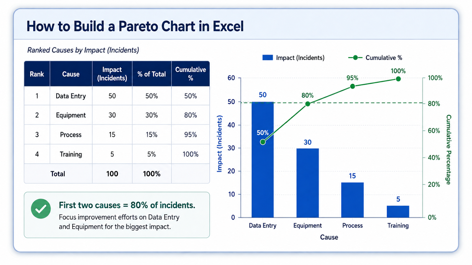
Assume four causes contribute 50, 30, 15, and 5 incidents. After sorting largest to smallest, the cumulative percentages are 50%, 80%, 95%, and 100%. The chart immediately shows that the first two causes account for 80% of the measured impact. That does not prove those two causes are easy to fix, but it gives the team a rational place to investigate first.
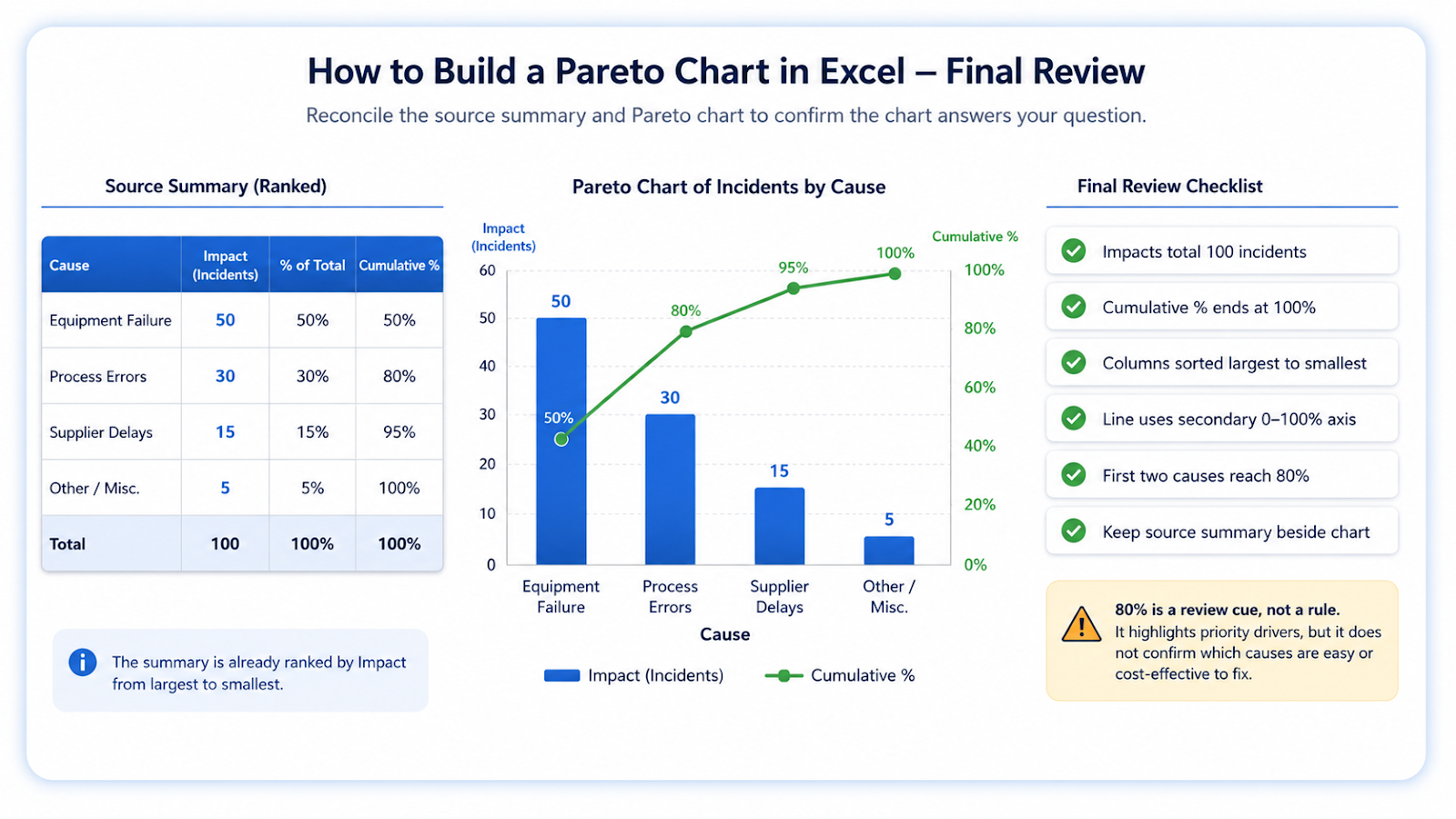
The impact measure should match the decision. Incident count is useful when every event has similar severity; cost, downtime, defects, or hours may be better when consequences differ. If one category occurs often but has little impact, a count-based Pareto can prioritize the wrong work. Keep the source summary beside the chart during review so the ranked amounts and cumulative percentages can be reconciled directly.
Use the 80% point as a review cue, not a rule
If the cumulative line crosses 80% after the second category, that tells you the first two categories account for most of the measured impact. It does not prove both should be fixed first. Cost, feasibility, risk, and root cause still matter. Keep the Pareto chart connected to the underlying amounts so reviewers can see whether a category is frequent, expensive, or time-consuming rather than treating the 80% threshold as an automatic action list.
Frequently asked questions
Does Excel have a built-in Pareto chart?
Modern versions do, but a manual combo chart provides more control and compatibility.
Can I use percentages as the column values?
Yes, if they represent the impact and the cumulative calculation is correct.
What should happen after the chart?
Investigate root causes and assign actions to the highest-impact categories.
Why is the cumulative line not reaching 100 percent?
The total or cumulative formulas do not cover all categories.
Continue building reliable Excel workflows
Browse more lessons in the OneXcel Tutorial Hub or explore free Excel resources.